Towe Wood
Client
Towe Wood
Project Scope
Visual Identity, Logo Design, Print Design, Motion Graphics
Towe Wood is a Slovak producer of high-quality, bespoke, hand-made furniture made of solid wood. Each piece of wood utilised in its production is naturally different; combining this with the company’s traditional hand-made process makes every product unique for every customer.
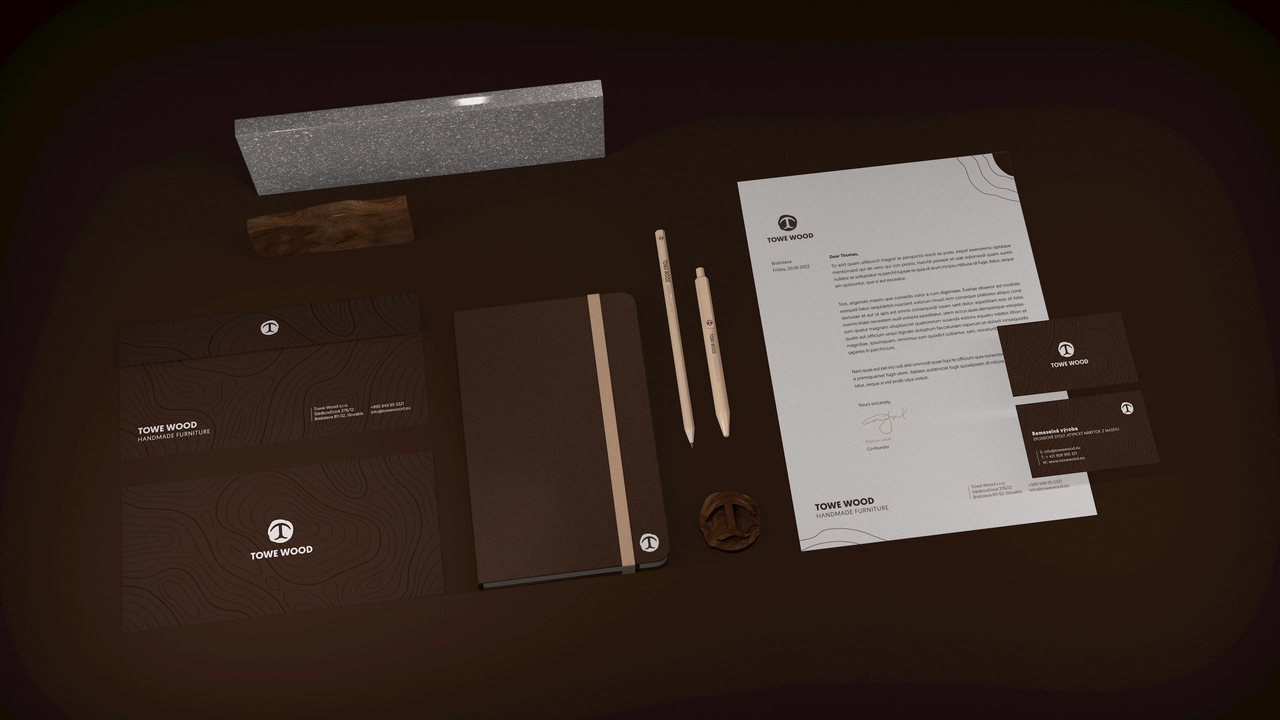
My job was to design the logo and visual identity that reflects the uniqueness of every product and the company’s process with a connection to the primarily used types of wood materials in their production.
Logo Concept
A distinctive logo for the company to differentiate itself from the competition while staying true to its origin and values. The capital T represents the initial letter of the owner’s name and the first letter of the company’s name. It is depicted as a tree—a symbol of growth and the company’s primary used material. The tree grows from two roots—two founders (wife and husband) of the company.
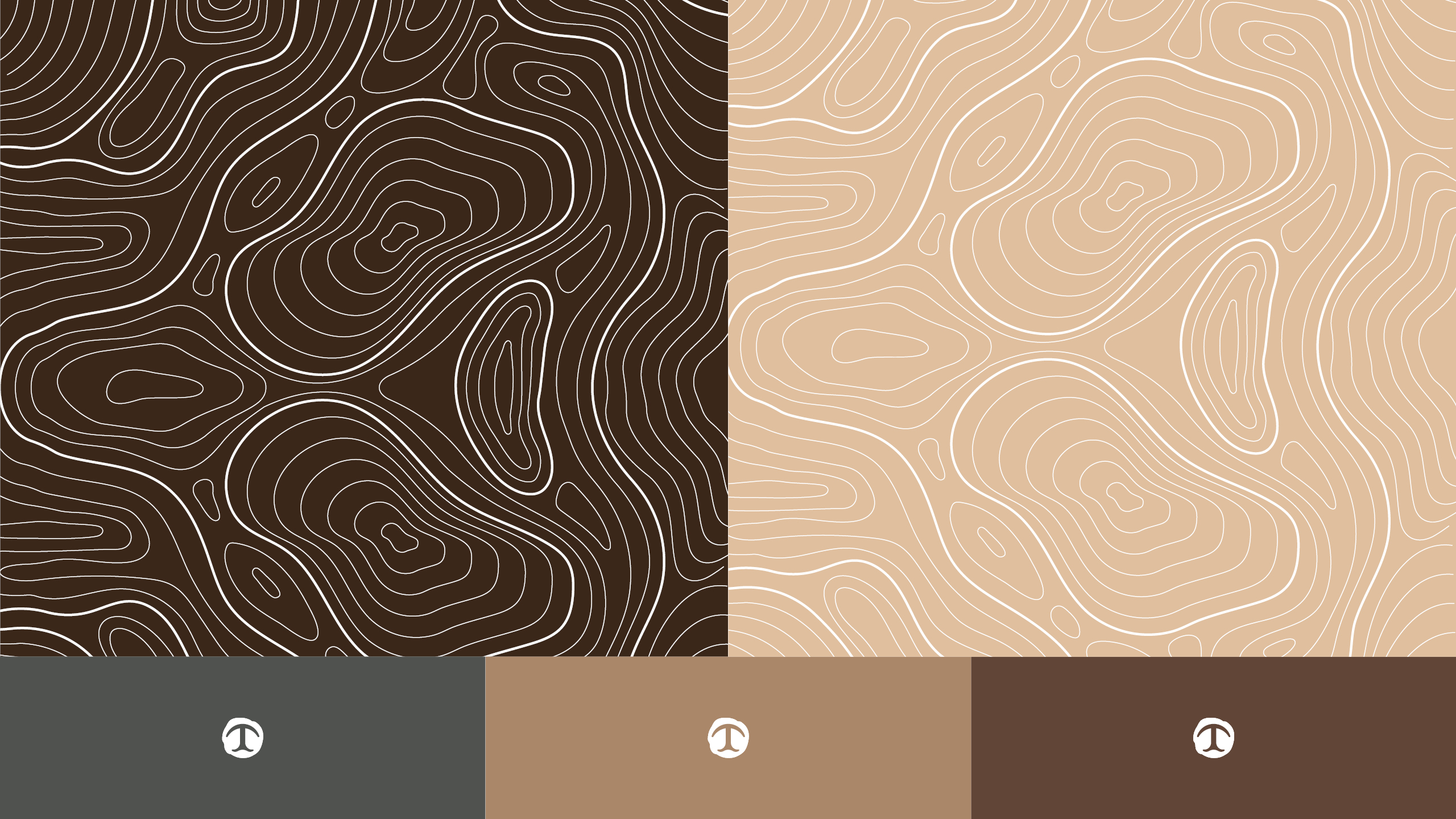
To make the tree stand out more and give the logo a more organic feel, I designed the surrounding negative space around it to look like a tree stump from above. Annual rings are a further component that contributes to conveying the hand-made quality, use of wood material, and uniqueness of the brands. Incorporating them into the logo (as a fingerprint) added too much complexity to the overall shape, making it unsuitable for digital platforms. It was, therefore, later used as a pattern.

Colours
Primary and secondary colours were selected based on the most used types of wood, along with one neutral grey colour, maintaining a little luxury and unique feeling.


